AFTER8® - Reimagining Intimacy for a New Generation.
Introduction
Details
Services :
Client :
AFTER8®
Year :
2026
Timeline :
8 Weeks
Credits
Branding :
Vinayak Agarwal
Typeface Deisgn :
Vinayak & Rajlaxmi
Photography :
Dhananjay Rawat
Packaging :
The Drawing Board

The Challenge
AFTER8 was created as a bold rethinking of how modern intimacy brands should look, feel and behave in culture.
The category was dominated by outdated visual systems:
overly clinical packaging
awkward messaging
masculine visual language
generic pharmacy aesthetics
emotionally disconnected branding
We saw an opportunity to transform condoms and pleasure products into something people would actually want to display, photograph and talk about.
AFTER8 was designed to sit somewhere between:
fashion
beauty
nightlife
pop culture
wellness
intimacy
The result is a brand that feels playful, expressive, premium and culturally relevant — while still maintaining trust and functionality.
This wasn’t just a packaging project.
It was a full cultural repositioning of what an intimacy brand could become.
Industry Problem
Most condom brands still communicate like pharmaceutical companies.
The category is filled with:
aggressive masculine tones
fear-based communication
outdated packaging systems
uninspired retail presence
lack of emotional connection
low social shareability
Even premium brands often feel:
overly polished
too sterile
emotionally cold
disconnected from younger audiences
Meanwhile, Gen-Z and millennial consumers increasingly expect brands to:
reflect their identity
participate in culture
feel expressive
feel aesthetic
feel worthy of being shared online
The category lacked a brand that could bridge:
intimacy + design culture
wellness + fashion
safety + playfulness
premium quality + internet energy
AFTER8 was built to solve exactly that.


Our Solution
The Opportunity
We identified a major whitespace in the intimacy category:
“Pleasure-first branding.”
Instead of focusing on:
fear
performance
hyper-masculinity
technical specifications
We shifted the conversation toward:
confidence
chemistry
intimacy
self-expression
visual identity
modern relationships
We wanted AFTER8 to feel like:
a fashion accessory
a beauty product
a nightlife brand
a social-first lifestyle company
—not simply a condom company.






The Outcome
Brand Positioning
AFTER8®
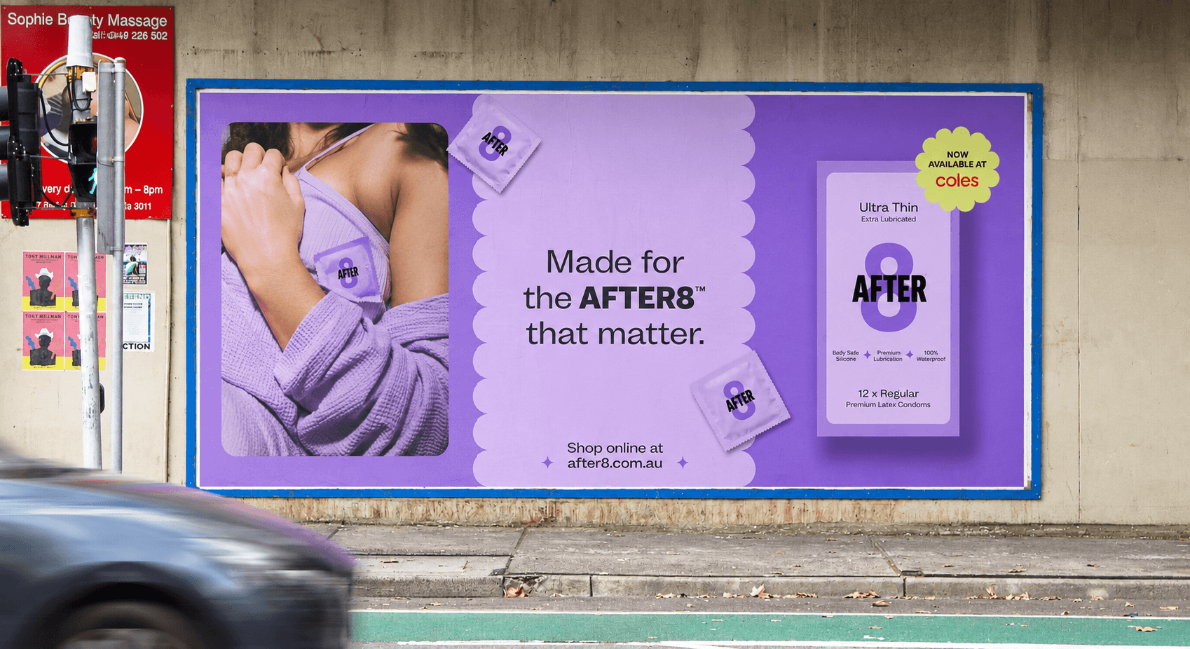
“Made for the moments after 8.”
AFTER8 positions itself as a premium intimacy and pleasure brand designed for modern nightlife culture.
The brand lives at the intersection of:
confidence
intimacy
expression
nightlife
pleasure
aesthetics
Rather than communicating like a healthcare company, AFTER8 behaves like a modern lifestyle brand.
The brand language is:
playful
flirtatious
premium
culturally aware
socially expressive
Target Audience
Primary Audience
Gen-Z & Millennial Consumers
Age: 21–35
Urban, digitally native consumers who:
care deeply about aesthetics
purchase based on brand identity
value expressive packaging
enjoy nightlife culture
share products online
want intimacy brands to feel modern
are familiar with fashion & beauty branding
This audience doesn’t want products that feel embarrassing.
They want products that feel:
stylish
safe
culturally relevant
expressive
confidence-building
Audience Psychology
Consumers in this category are not just buying condoms.
They’re buying:
confidence
chemistry
emotional comfort
attraction
intimacy
identity
This insight became foundational to the entire brand strategy.
AFTER8 was designed to reduce awkwardness and increase emotional desirability.
Every touchpoint was designed to feel:
inviting
warm
playful
stylish
collectible
Brand Strategy
The strategic objective was simple:
Make intimacy feel aesthetic.
To achieve this, we built a system around 5 pillars:
01 — Emotional Warmth
The brand needed to feel welcoming rather than clinical.
02 — Cultural Relevance
The brand had to feel native to social media culture.
03 — Shelf Impact
Packaging needed to dominate both retail shelves and digital thumbnails.
04 — Social Shareability
Products should feel photographable and collectible.
05 — Premium Accessibility
The brand should feel premium without becoming intimidating.
Naming Strategy
AFTER8®
The name AFTER8 references:
nightlife
chemistry
evening intimacy
post-work freedom
social connection
emotional energy
It immediately creates curiosity while remaining minimal and memorable.
The “8” becomes a recognizable visual mnemonic across:
packaging
advertising
social media
merchandise
campaign graphics
website systems
The number itself also visually resembles:
connection
flow
intimacy
balance
This made the symbol incredibly powerful within the identity system.
Visual Identity System
The identity system was designed to feel:
bold
iconic
scalable
culturally flexible
instantly recognizable
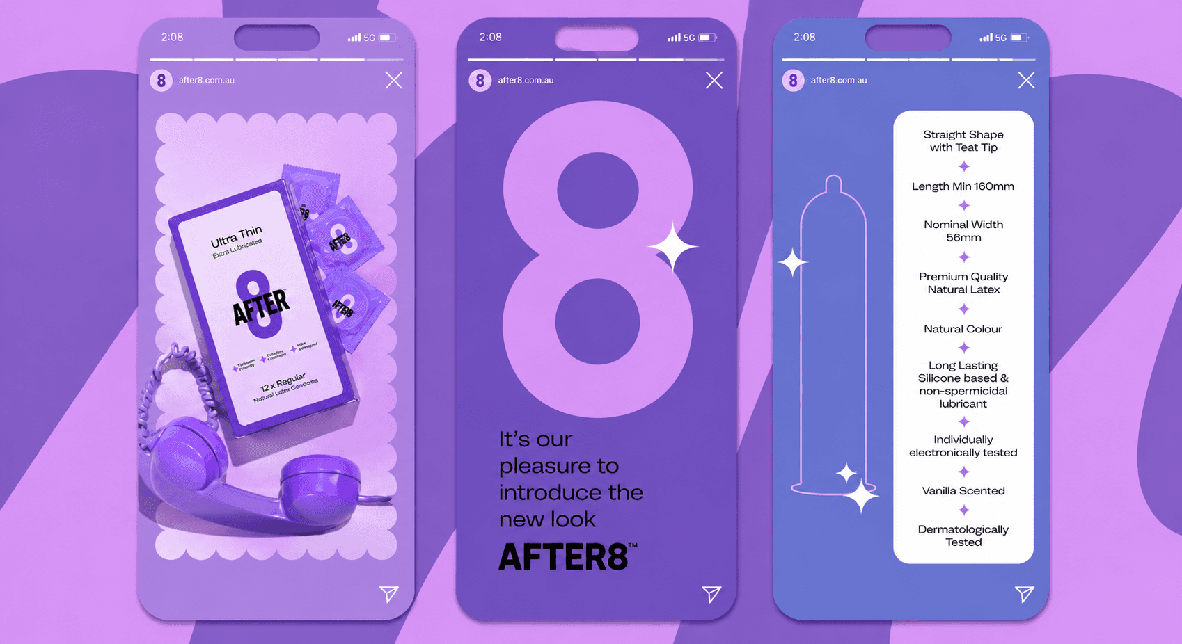
The oversized “8” became the hero asset.
Instead of relying on complicated logos, illustrations or symbols, we focused on:
recognizability
repetition
memorability
silhouette impact
The typography was intentionally:
thick
soft
rounded
playful
expressive
The visual language balances:
softness
boldness
humour
sensuality
without becoming explicit.
Packaging Design
The packaging system was designed to feel somewhere between:
candy packaging
skincare
fashion accessories
beauty products
editorial graphics
We intentionally avoided:
dark masculine tones
metallic clichés
overly sexual visuals
pharmaceutical aesthetics
Instead, we built a system based around:
bright gradients
pastel palettes
playful flavour coding
scalloped frames
oversized typography
emotional softness
Packaging Architecture
Each flavour was assigned its own emotional palette:
Grape
Purple / lavender Soft nightlife energy.
Strawberry
Hot pink Playful chemistry.
Mint
Lime green Freshness & confidence.
Cola
Orange Bold extroverted energy.
Mango
Warm yellow-orange Tropical warmth.
Pineapple
Bright citrus yellow Fun & energetic.
The flavour system allows:
strong shelf differentiation
strong social content variation
scalable future product launches
Structural Packaging System
The front panel architecture was intentionally minimal.
The system uses:
oversized “8”
strong flavour naming
minimal product hierarchy
large whitespace
soft framing systems
This creates:
premium simplicity
strong recognizability
easy scanning in retail
social media visibility
The side panels were designed to feel editorial rather than technical.
Even mandatory product information was integrated into the visual system instead of feeling disconnected.
Product Photography Direction
Photography was art directed to feel:
cinematic
emotional
nightlife-inspired
intimate
fashionable
Instead of typical product photography, we focused on:
colour lighting
nightlife moods
playful styling
fashion-inspired framing
tactile softness
emotional chemistry
The goal was to make the brand feel:
desirable
aspirational
social-first
rather than medical.
Campaign Direction
AFTER8 campaigns were designed around:
emotional storytelling
nightlife energy
playful intimacy
expressive confidence
The campaign language avoids:
awkwardness
explicitness
hyper-sexual advertising
Instead, the brand speaks through:
confidence
chemistry
humour
visual culture
Campaign Messaging
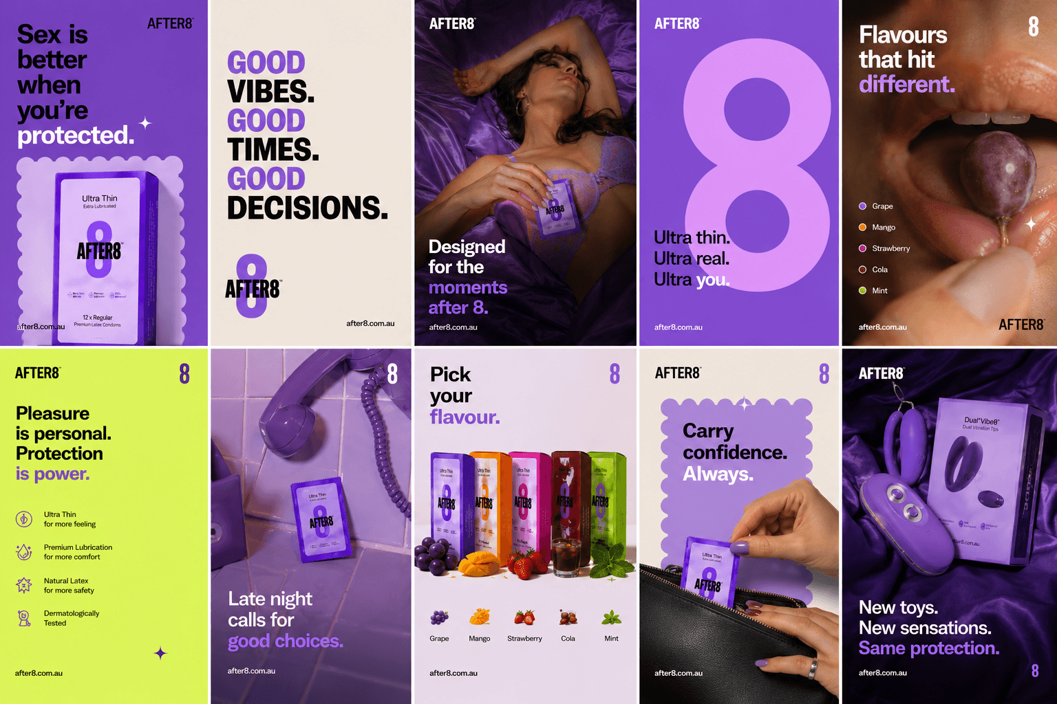
Examples of campaign messaging include:
“Made for the moments after 8.”
“Pleasure with personality.”
“Designed for better chemistry.”
“Less awkward. More AFTER8.”
“Looks good. Feels better.”
“Confidence looks good on you.”
The copy system was designed to feel:
socially native
emotionally intelligent
minimal
modern
Social Media Strategy
Most intimacy brands struggle to create:
consistent social systems
culture-led content
strong visual branding
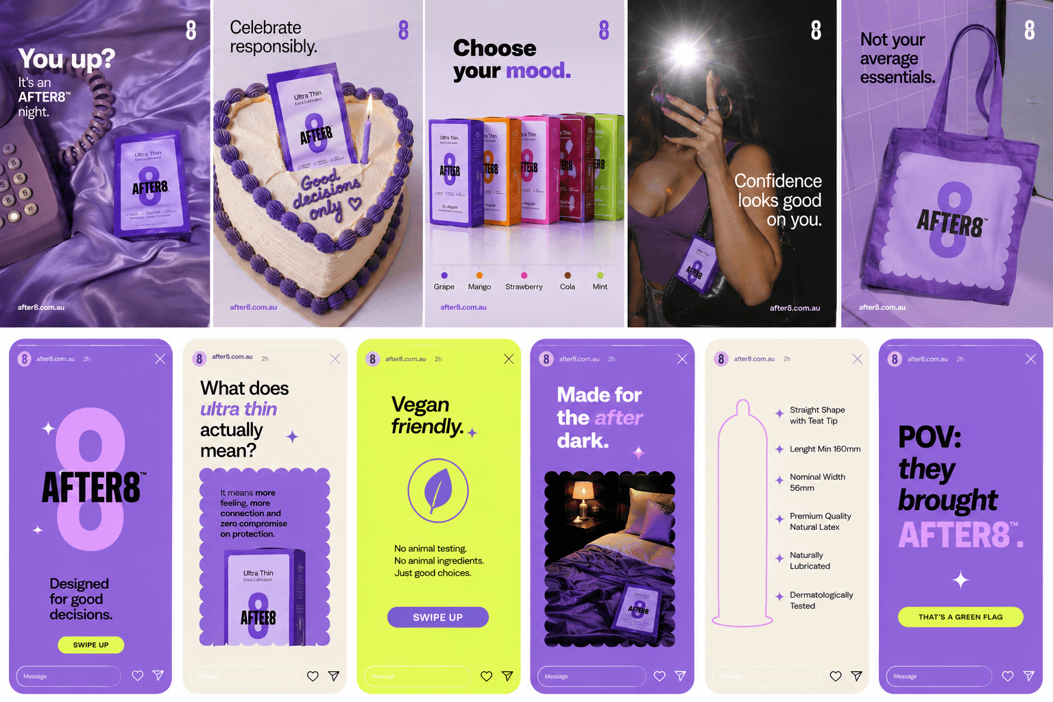
AFTER8 was designed to feel naturally social-first.
The social media strategy focused on:
repeatable graphic systems
bold colour blocking
editorial layouts
product closeups
lifestyle imagery
campaign typography
playful storytelling
The goal was to create a feed that felt closer to:
fashion brands
beauty brands
Gen-Z lifestyle brands
rather than healthcare companies.

