ALDER - Outdoor Essentials Built For Slower Movement
Introduction
Details
Services :
Client :
Alder
Year :
2026
Timeline :
4 Weeks
Credits
Brand Deisgn :
Vinayak Agarwal
Brand packaging :
Vinayak Agarwal & Rajlaxmi
Brand typography :
Rajlaxmi
Photography :
Agusta Sussie

The Challenge
The Challenge
The modern outdoor market has become saturated with:
aggressive performance branding
loud adventure messaging
masculine survival aesthetics
tactical visual systems
overly technical communication
Most brands either looked:
too “mountaineering”
ortoo fashion-focused without functionality.
There was a visible market gap for:
premium outdoor essentials that feel emotionally calming, refined and editorial while still remaining technically functional.
Alder was designed to fill that gap.
Market Analysis & Competitor Study
We analysed the positioning, communication and visual systems of:
Arc'teryx
Patagonia
Snow Peak
And Wander
Satisfy Running
District Vision
Key Insights
Most outdoor brands communicate performance.
Very few communicate emotion.
Most sustainability brands feel “eco-first”.
Very few feel premium and editorial.
Most technical brands feel intimidating.
Very few feel approachable and calm.
The Gap We Identified
We identified an emerging audience that:
values aesthetics and functionality equally
seeks quieter outdoor experiences
prefers slower travel over extreme adventure
purchases elevated essentials instead of trend-driven products
appreciates editorial visual systems
This became the foundation of Alder.


Our Solution
Brand Positioning
Alder is:
thoughtful
restrained
functional
emotionally calming
premium
timeless
Alder is NOT:
aggressive
tactical
sporty
overly masculine
trend-driven
Brand Philosophy
Built for slower movement.
Alder believes outdoor clothing should:
disappear into the experience
support movement naturally
feel timeless
age beautifully
reduce visual noise
Every design decision was made around restraint and intentionality.
Primary Consumer
Creative professionals aged 25–40:
designers
architects
photographers
founders
filmmakers
writers
remote workers
mindful travellers
People who:
hike occasionally
travel frequently
value sustainability
buy fewer but better products
prefer understated luxury
Brand Personality
Trait | Description |
Calm | Quiet visual communication |
Functional | Purpose-driven product design |
Editorial | Fashion-inspired layouts |
Minimal | Restrained branding system |
Timeless | Long-term visual relevance |
Human | Emotional storytelling |
Naming Strategy
The name “Alder” comes from the alder tree.
The alder tree symbolizes:
resilience
adaptability
grounding
calm strength
It naturally aligned with the brand’s positioning around:
slower movement
natural connection
quiet exploration
The name also feels:
short
memorable
premium
globally adaptable
Logo Design Journey
The logo was intentionally designed to feel:
elegant
timeless
calm
editorial
fashion-forward
outdoor-luxury
Instead of using:
mountain symbols
trees
compass icons
hiking graphics
we chose a typography-first identity.
This decision was important because premium brands often rely on:
restraint instead of decoration.
Typography Exploration
Multiple type directions were explored during the process.
We studied:
high-fashion serif typography
editorial magazine systems
outdoor apparel branding
modern luxury visual systems
The final typography direction was inspired by:
refined serif structures
elegant contrast
sophisticated spacing
timeless editorial layouts
Why We Chose This Typeface
The final typeface was selected because it communicates:
confidence
calmness
luxury
timelessness
The elongated vertical forms create:
elegance
breathing space
softness
while the subtle serif detailing introduces:
craftsmanship
sophistication
emotional warmth
The typography system balances:
outdoor functionality + editorial luxury.
Logo Construction
The wordmark was refined carefully through:
spacing adjustments
optical balancing
contrast refinement
proportion corrections
The objective was to create:
a logo that feels premium without trying too hard.
Every letterform was treated with restraint to ensure:
versatility
scalability
timelessness
Color Palette Strategy
The color system was inspired by:
forests
moss
fog
stone
aged paper
natural landscapes
Primary Palette
Forest Green
Represents:
calmness
nature
grounding
sophistication
Used across:
packaging
website
editorial layouts
social media
Warm Ivory
Chosen instead of pure white because it feels:
tactile
softer
printed
premium
timeless
This subtle change elevated the entire visual identity.
Why The Palette Works
Most outdoor brands use:
bright technical colors
aggressive contrast
loud performance palettes
Alder intentionally moved toward:
muted natural tones
cinematic shadows
editorial warmth
This helped create:
emotional sophistication instead of visual aggression.






The Outcome
Photography Direction
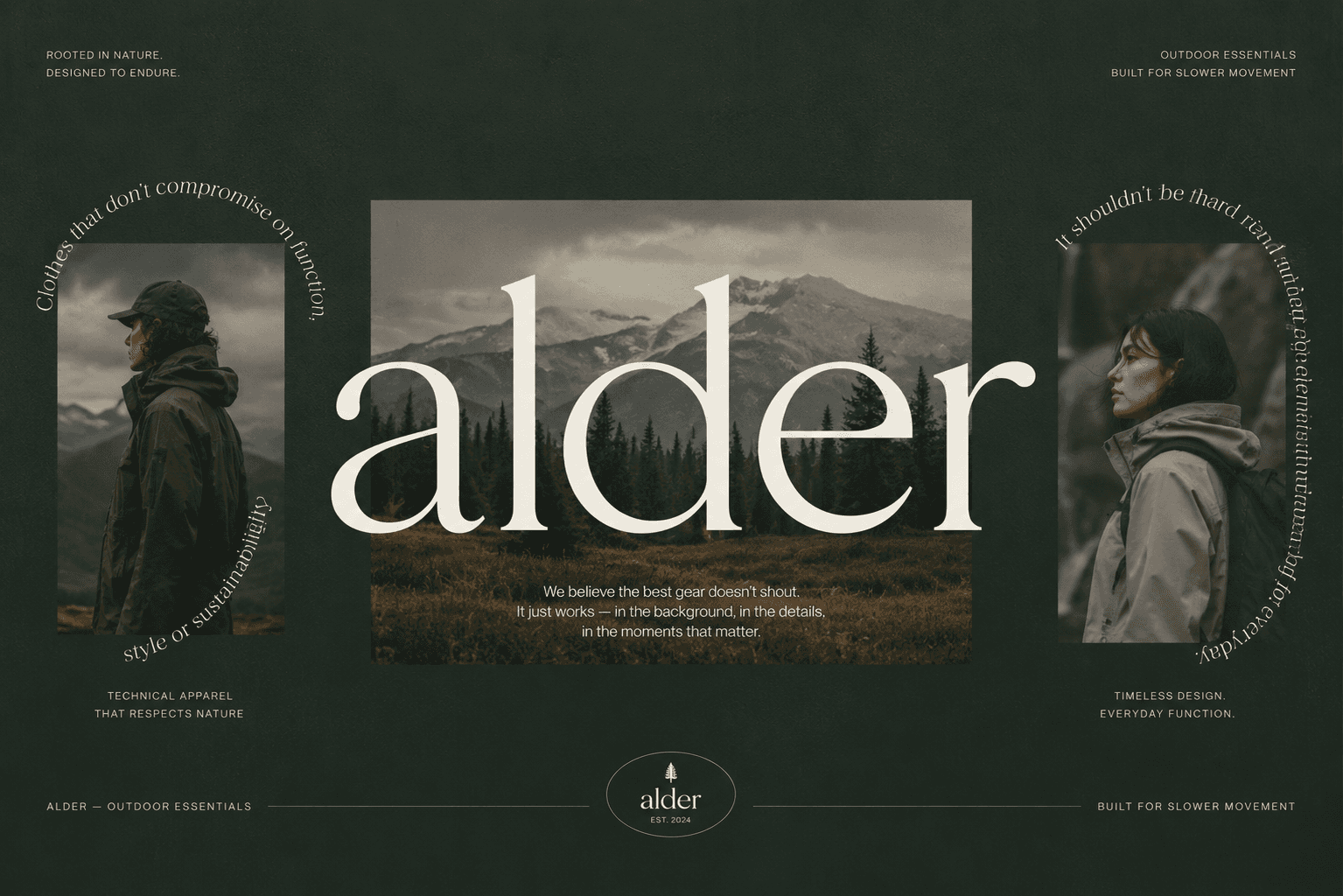
Photography became one of the strongest identity elements.
We intentionally avoided:
hyper-commercial outdoor imagery
extreme sports visuals
artificial studio setups
Instead, we focused on:
foggy forests
natural shadows
soft movement
texture
stillness
candid moments
The result feels:
intimate
cinematic
human
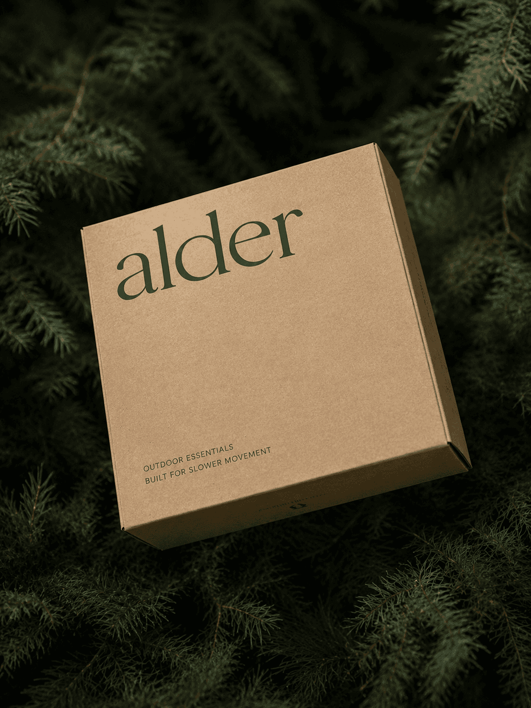
Packaging System
The packaging system was designed to reflect:
sustainability
simplicity
tactile luxury
Materials:
kraft paper
textured recycled stock
matte finishes
minimal ink usage
The structure feels:
elevated
minimal
environmentally conscious
without appearing “eco-generic”.
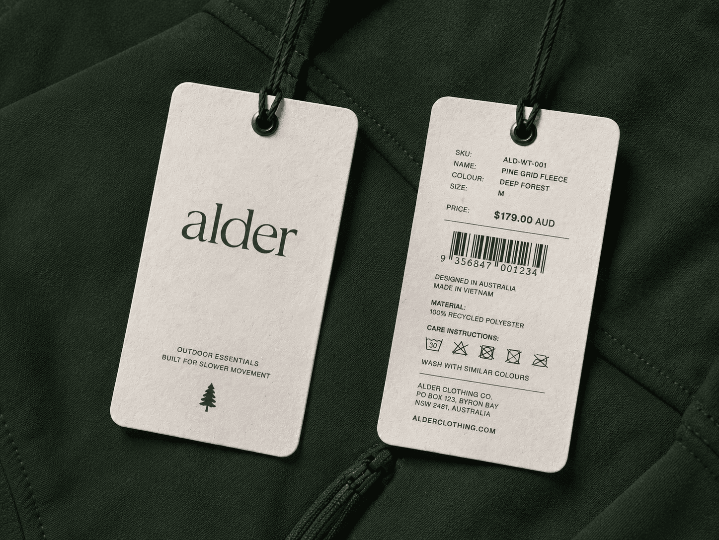
Hang Tag System
The hang tags combine:
premium editorial typography
retail functionality
sustainability messaging
The front side focuses on:
emotional branding
positioning
minimal storytelling
The reverse side includes:
SKU information
material composition
manufacturer details
care instructions
caution icons
website information
This creates a complete premium retail experience.
Social Media Positioning
The social strategy was designed around:
calm storytelling
editorial layouts
intentional pacing
emotional messaging
Instead of pushing products aggressively, the content focuses on:
movement
atmosphere
sustainability
outdoor lifestyle
thoughtful living
This positions Alder as:
a lifestyle brand first, product brand second.
Website Experience
The website was designed to feel:
cinematic
minimal
immersive
editorial
Large whitespace, muted imagery and restrained typography help communicate:
premium confidence.
The UI intentionally avoids:
visual clutter
loud CTAs
overdesigned interactions
Every interaction is slower and calmer.
Brand Messaging
Core messaging pillars:
slower movement
thoughtful design
sustainability
timeless essentials
emotional connection with nature
The tone of voice remains:
minimal
confident
human
understated
Outcome
The final identity system positions Alder as:
a premium modern outdoor label for a new generation of mindful explorers.
The project successfully bridges:
fashion
technical functionality
sustainability
editorial design
while maintaining a highly cohesive visual system across:
packaging
apparel
digital
social
retail applications
Conclusion
Alder proves that outdoor brands don’t need to rely on:
loud branding
aggressive visuals
technical overload
to feel premium or functional.
By combining:
emotional storytelling
restrained typography
cinematic imagery
sustainable thinking
editorial systems
Alder creates a distinct position within the modern outdoor market.
The result is a brand that feels:
timeless
elevated
emotionally intelligent
globally relevant
and capable of standing beside leading premium outdoor brands while maintaining its own unique identity.

